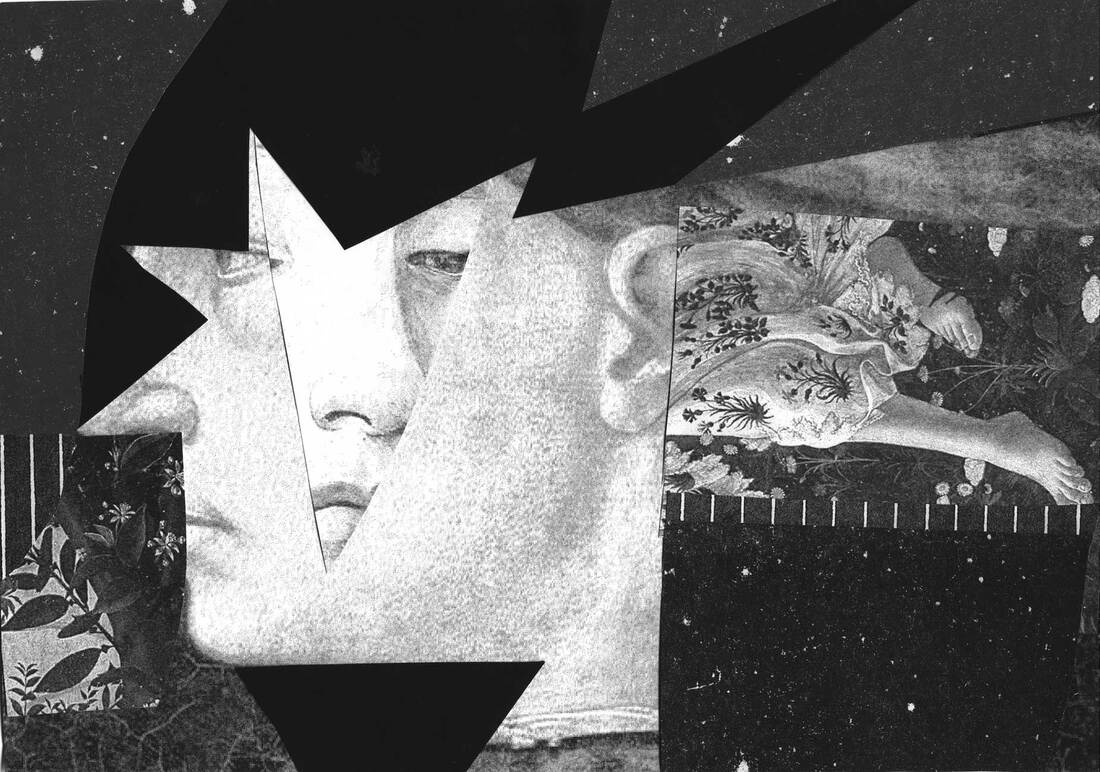
Above: Ryan Putnam, "NOPE" "NO" "NAH" 11" x 14" each (2019) Risograph
|
RISO-PRINTING: AN OVERVIEW – Printed Matter, Inc.
The Risograph – a plain-looking, clunky machine first released in Japan in 1986 by the Riso Kagaku Corporation – was initially developed as an alternative to other widespread copying processes. Marketed to churches, offices and schools, the Risograph offered a high-quality, cost-effective, and environmentally friendly option ideal for large-volume printing. As an office standard the Risograph lost out to the photocopier, but the possibilities of riso-printing were adopted by a generation of artists and independent publishers who would give the machine new purpose. Working with the strengths and limitations of the technology, artists began creating posters, zines and artists’ books that embraced a lo-fi, pixelated aesthetic and allowed for endless experimentation with color, saturation and registration. The quality of a Risograph print is somewhere between a photocopy and screen print – and like a screen print the image originates through a stencil duplication process. The artwork is scanned or transferred by computer to the machine, which then burns it onto a thin plastic sheet. This creates a ‘master’ copy, which gets wrapped around a drum and rotated at high speed so that the ink is pushed through the screen and onto the paper. |
|
|
TECHNIQUE BASICS
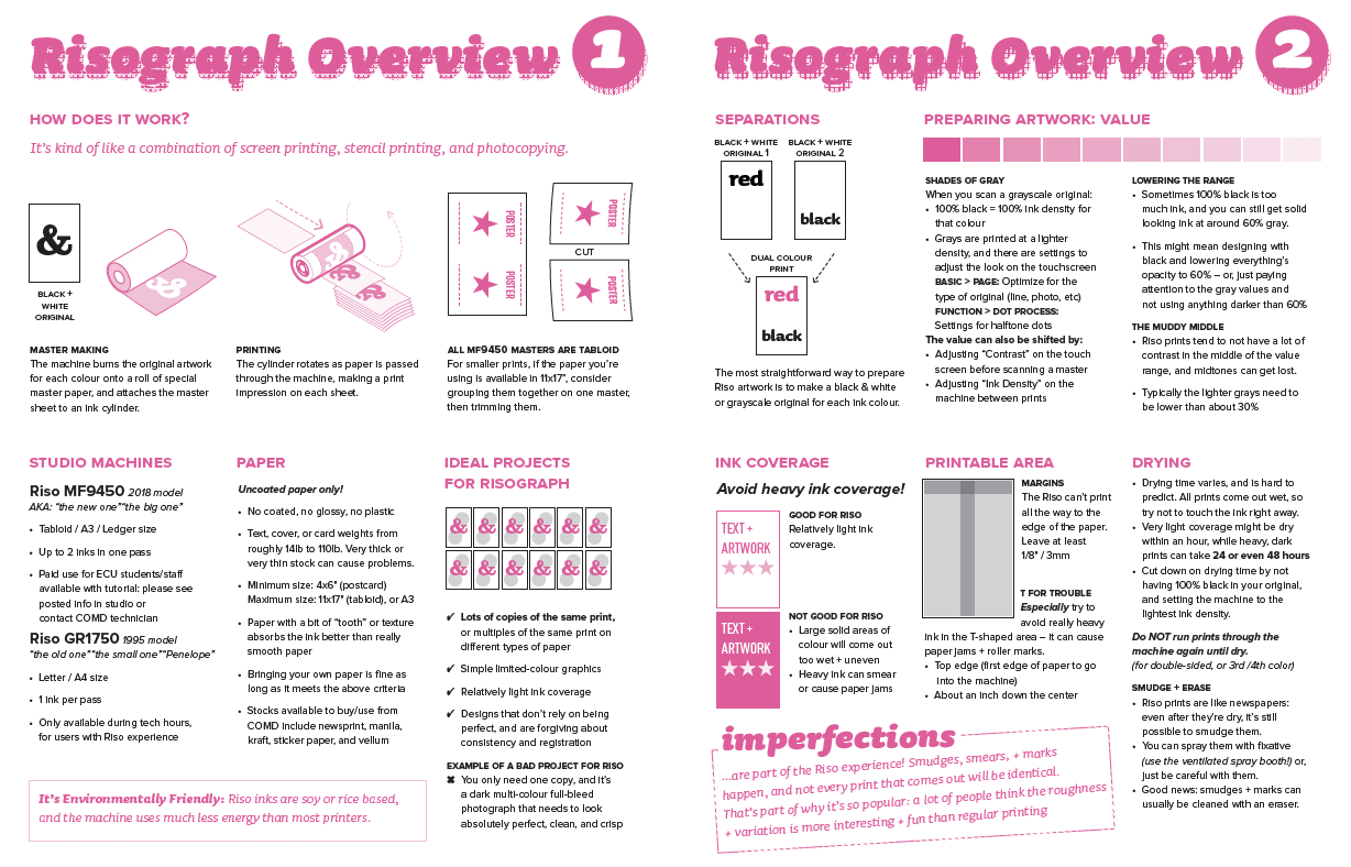
HOW DOES THE RISO MF9450 WORK?
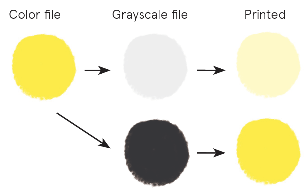
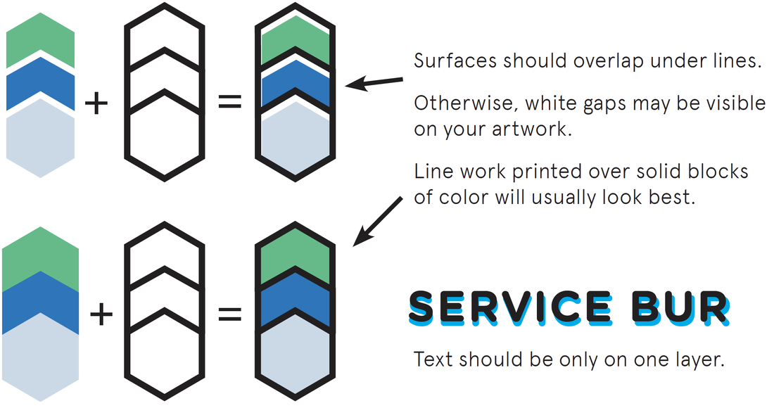
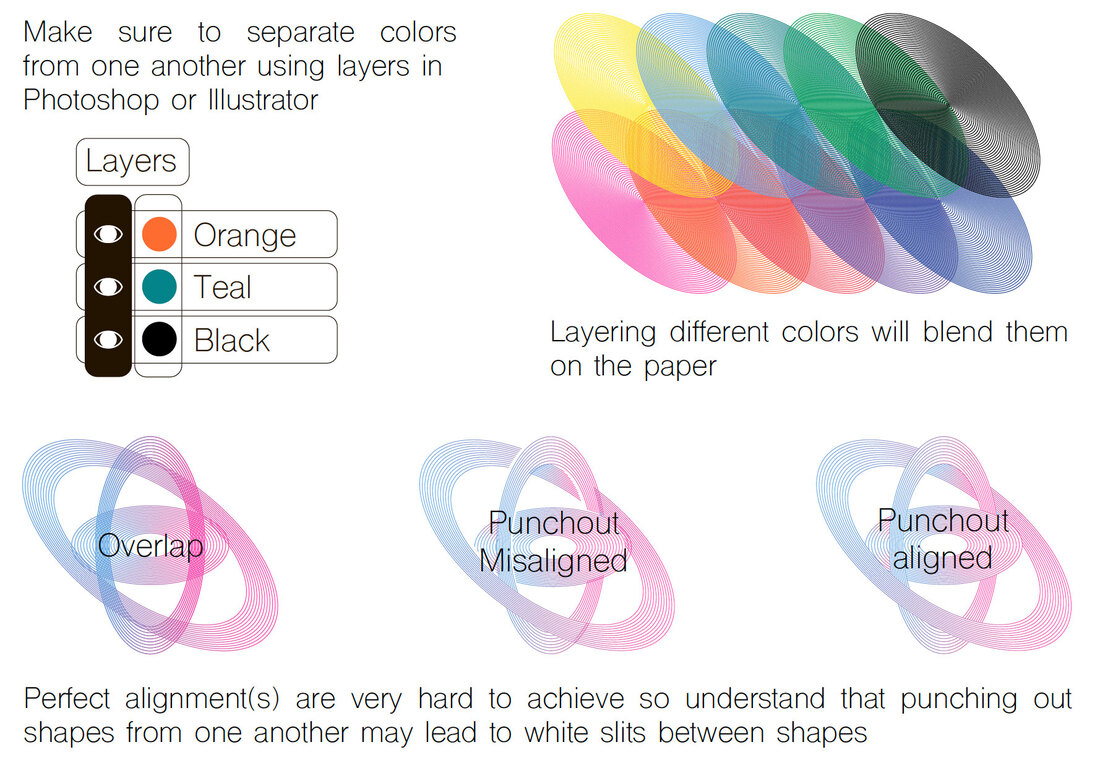
It’s kind of like a combination of screen printing, stencil printing, and photocopying. Each screen is made from banana paper and the printing process itself is highly energy efficient— generating only a minimum amount of biodegradable waste. The soy based inks do not contain a drying agent so will never dry completely. MASTER MAKING MODE The machine burns the original artwork for each color onto a roll of special master paper and attaches the master sheet to an ink cylinder. PRINTING MODE The cylinder rotates as paper is passed through the machine, making a print impression on each sheet. PRINTABLE AREA • Max. Printing Area: 11 15/32” x 16 23/32” • Min. Printing area: 4” x 6” • The Riso can’t print all the way to the edge • Consider grouping smaller prints together on one master, and trimming them after printing. This saves paper, master material and time. PAPER Paper: Choosing Ideal Stocks for Riso – Stencil.wiki • Uncoated paper only! No coated, no glossy, no plastic! • Minimum weight: 12 lb. (46g/m²) Maximum weight 110 lb. (210g/m²). • Very thick or very thin stock can cause problems. • Paper with a bit of “tooth” or texture absorbs the ink better than really smooth paper • Check out the paper stock at French Paper or Lewis Paper COLOR SEPERATIONS The most straightforward way to prepare Riso artwork is to make a black & white or grayscale original for each ink color. PREPARING ARTWORK "THINK IN SHADES OF GREY" When you scan a grayscale original: • 100% black = 100% ink density for that color • Grays are printed at a lighter density, and there are settings to adjust the look on the touchscreen BASIC > PAGE: Optimize for the type of original (line, photo, etc.) FUNCTION > PROCESS: Settings for halftone dots • Inks are semi-transparent, so they can be printed on top of each other to create more color options. • Use the ‘multiply’ blend mode in photoshop to see an approximation of how your design might look in print. The value can also be shifted by: • Adjusting “Contrast” on the touch screen before scanning a master • Adjusting “Ink Density” on the machine between prints LOWERING THE RANGE • Sometimes 100% black is too much ink. You can still get solid ink coverage around 60% gray. • This might mean designing with black and lowering everything’s opacity to 60% gray. THE MUDDY MIDDLE • Riso prints tend to not have a lot of contrast in the middle of the value range, and midtones can get lost. • Typically, the lighter grays need to be lower than about 30% TEXT • Text should be only on one layer of the printed design, or it will be blurry • For best results, make sure any body text (12pt or smaller) is set to registration black in Illustrator or InDesign – even if you’re not printing using black ink • If the Riso knows it’s printing text it will preserve sharpness and ensure a higher quality print. • We recommend not using Photoshop to set type, as this means it is rasterized and no longer seen by the machine as text. • Legibility of text deteriorates drastically at lower opacity, so avoid printing body text or important information in pale colors – save that for large titles or decorative text. • Avoid using ‘knockout’ or white text, as the riso isn’t reading the text but rather the area around the text, so it’s not as sharp. • We don’t recommend using white text on two-color prints as these will not line up perfectly, meaning it will not be very readable in print. IDEAL RISO PROJECTS • Lots of copies of the same print, or multiples of the same print on different types of paper. • Simple limited-color graphics with relatively light ink coverage • Designs that don’t rely on being perfect, and are forgiving about consistency and registration • Imperfections are part of the Riso experience! Smudges, smears, + marks happen, and not every print that comes out will be identical. BAD RISO PROJECTS • You only need one copy, and it’s a dark multi-color full-bleed photograph that needs to look absolutely perfect, clean, and crisp. • Overprinting small details or text as they won’t always line up perfectly. Each print can vary by 3mm in any direction. INK COVERAGE Good for Riso: Relatively light ink coverage. Not Good for Riso: Large solid areas of color will come out too wet and uneven. Heavy ink can smear and cause paper jams DRYING • Drying time varies and is hard to predict. • Prints come out wet. Don’t touch the ink right away. • Very light coverage might be dry within an hour. • Heavy, dark prints can take 24-48 hours • Cut down on drying time by not having 100% black in your original and set the machine to the lightest ink density. Do NOT run prints through the machine again until dry. • This is for double-sided, or 3rd /4th color • Give 24 hours of drying time after printing the second layer SMUDGE AND ERASE • Even after a print is dry, it’s still possible to smudge them. • Smudges and marks can usually be cleaned with an eraser. |
TEMPLATES + FILE PREPARATION
Blue/Pink/Yellow/Black Template File – Illinois.edu RESOURCES
RESOURCES from various Risograph Studios
OTHER RESOURCES
|
IMPERFECTIONS OF RISO PRINTS
Smudging: Risograph ink is made from a combination of soy-oil, water and pigment. Only some types of paper are suitable for printing with the Riso and the prints will always retain a newspaper like quality - with enough effort you will find that the ink can smudge and rub off onto your finger tips.
Roller marks: Heavy ink coverage in a print can often result in marks when printing successive layers or on the reverse side of the press sheet. The Riso feeds paper using a set of rubber tires that travel across the center of the sheet. When feeding paper that has already been printed this can often result in track marks on the lead edge of the sheet.
Uneven ink coverage: The Risograph creates prints using a rubber roller which presses the sheet of paper against the print drum as it spins. The speed of printing and surface of the roller do not create perfect impressions. Large flat areas of ink coverage can sometimes appear slightly uneven.
Registration & Trapping: Risographs are designed for simple 1 or 2 color graphics. To get the best results when printing more complex artwork, it is important to include trapping. Trapping is the process of adding overlap between colours that interact in order to avoid gaps or white spaces in case of misregistration. If you have any questions or need help adding trapping we're happy to do so.
Smudging: Risograph ink is made from a combination of soy-oil, water and pigment. Only some types of paper are suitable for printing with the Riso and the prints will always retain a newspaper like quality - with enough effort you will find that the ink can smudge and rub off onto your finger tips.
Roller marks: Heavy ink coverage in a print can often result in marks when printing successive layers or on the reverse side of the press sheet. The Riso feeds paper using a set of rubber tires that travel across the center of the sheet. When feeding paper that has already been printed this can often result in track marks on the lead edge of the sheet.
Uneven ink coverage: The Risograph creates prints using a rubber roller which presses the sheet of paper against the print drum as it spins. The speed of printing and surface of the roller do not create perfect impressions. Large flat areas of ink coverage can sometimes appear slightly uneven.
Registration & Trapping: Risographs are designed for simple 1 or 2 color graphics. To get the best results when printing more complex artwork, it is important to include trapping. Trapping is the process of adding overlap between colours that interact in order to avoid gaps or white spaces in case of misregistration. If you have any questions or need help adding trapping we're happy to do so.
|
Olivia runs a small risograph printing press called Pindot Press, which serves artists. The channel offers tips and tutorials having to do with making art and zines on a risograph duplicator.
Find Out More
|
|
|
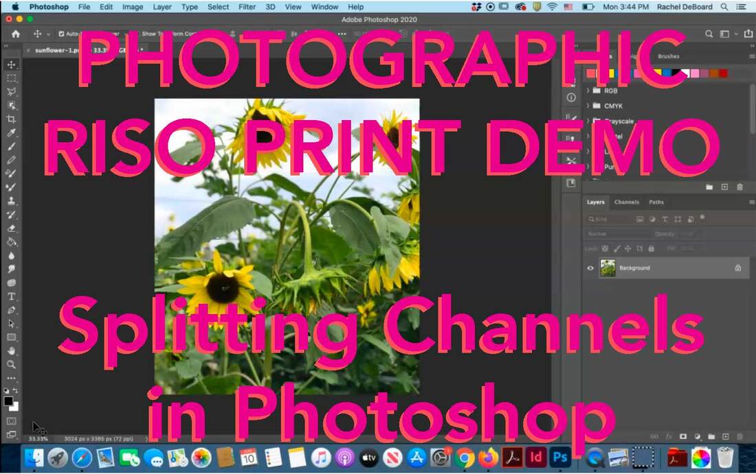
Splitting Channels in Photoshop
|
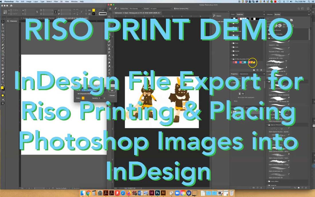
InDesign File Export & Placing Photoshop Images into InDesign
|
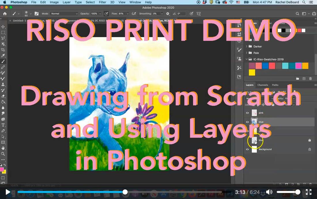
Drawing from Scratch and Using Layers in Photoshop
|
|
|
|
|
|
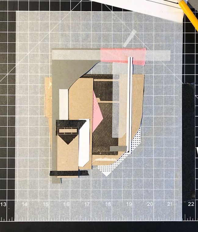
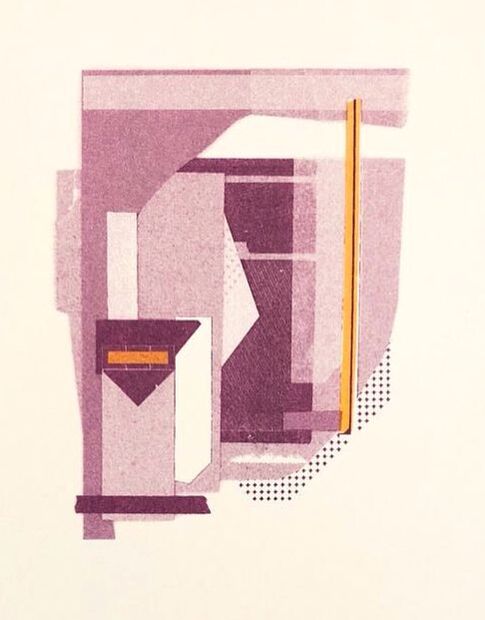
PAPER COLLAGE TECHNIQUE
The flatbed scanner on the Risograph allows you to create prints without the need for a computer.
|
|
COLOR AND OPACITY TEST SHEETS

School of Art + Design, Univ. Of Illinois, 4-color overprint chart (n.d.)
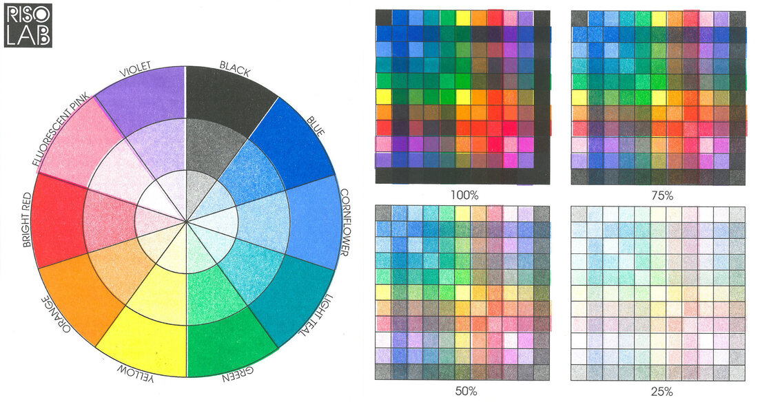
RISOLAB. 10-color test in varying opacity (n.d.)
|
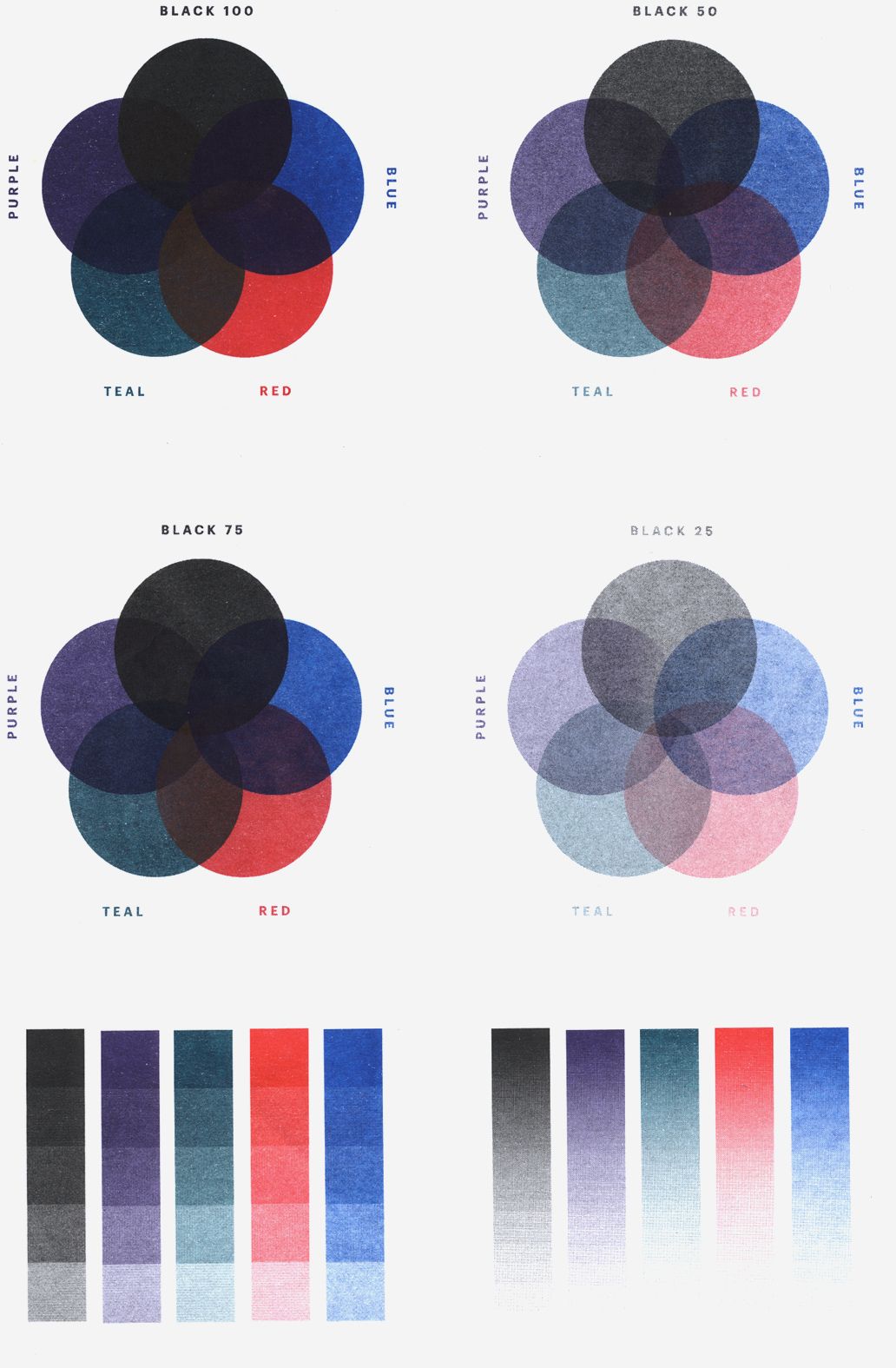
Erik Kiesewetter (Constance). Risograph Printing Chart showing 100%. 75%, 50% and 25% opacity overprinting (n.d.)
|
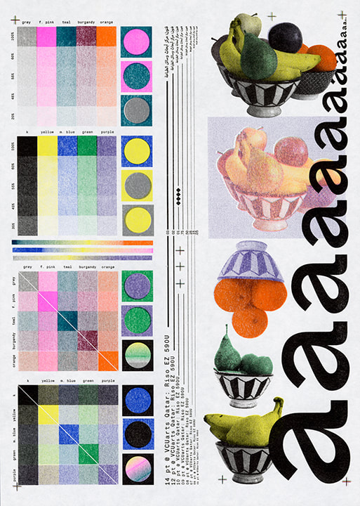
Sean Kuhnke. 10-color test, printed on a Riso EZ 590U (2018)
|
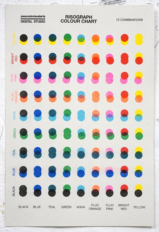
Peacock Visual Arts, 9-color overprint chart, A5 sized (n.d.)
|
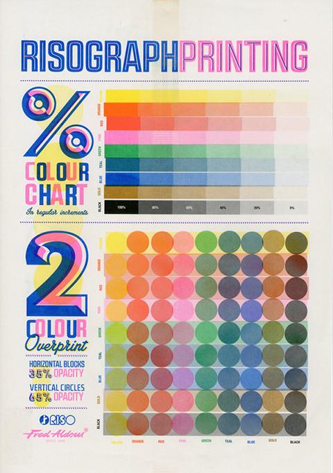
Jake Beddow (Fred Aldous), 2 color overprint chart with 35% horizontal and 65% vertical opacity. (n.d.)
|
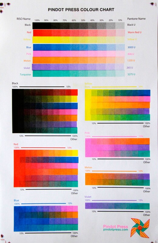
Pindot Press. 8-Color overlay chart. (n.d.)
|
RISOGRAPH ARTISTS
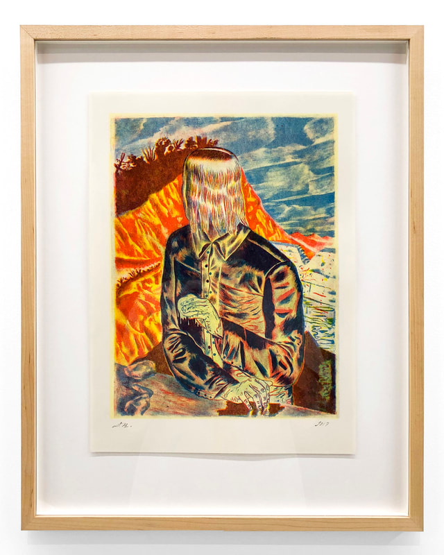
David Ryan, "SPL" Risograph. 16.5" x 20.5" (2019)
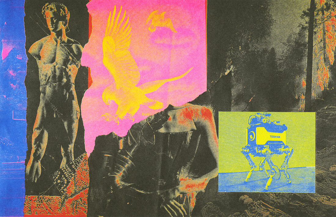
Panayiotis Terzis, "Apollo's Reckoning" RIsograph (2018)
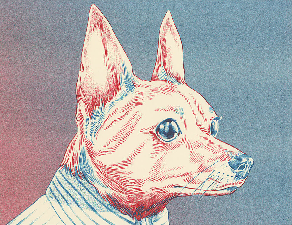
Anuj Shrestha, "Layla" Risograph in Bright Red and Light Teal, 8.5 x 11 (2019)
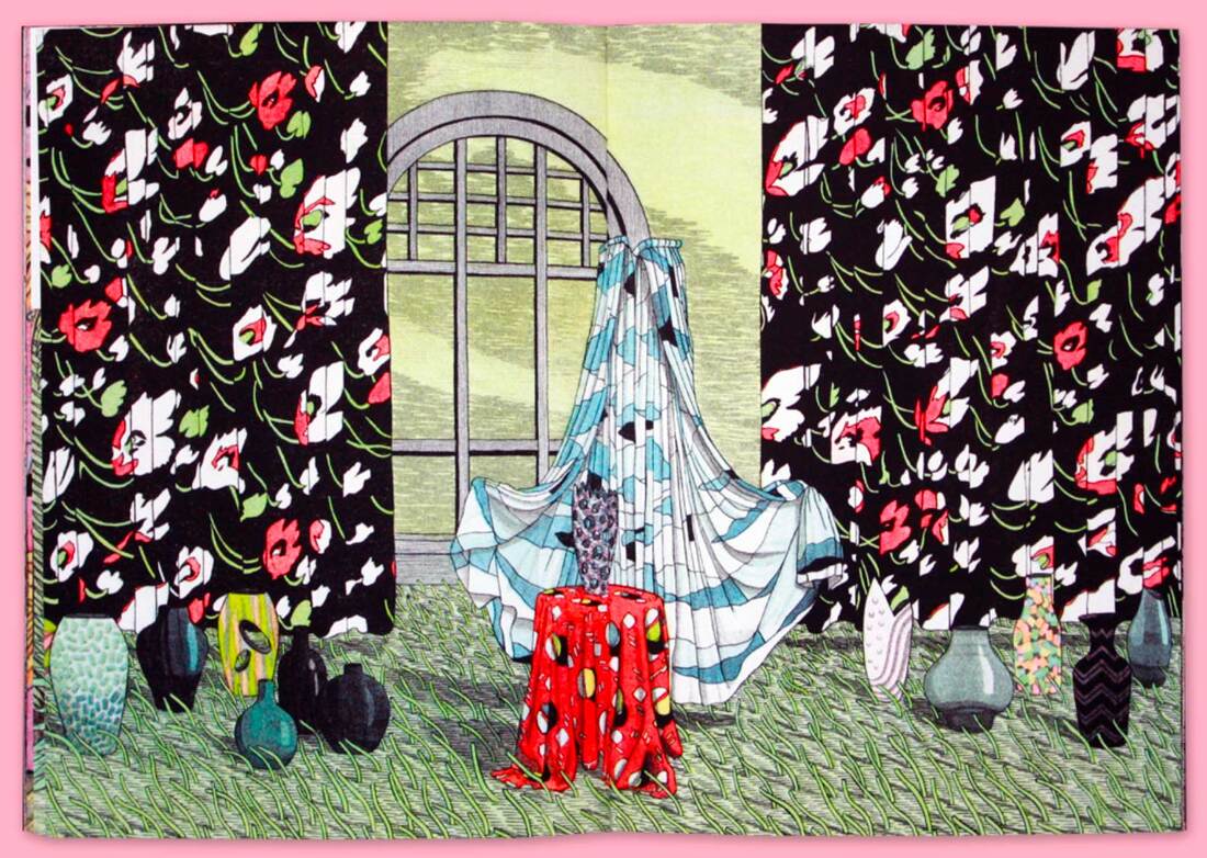
Luke Painter, "Bauble Bauble" 4-color Risograph Book,
28 pages, 6"x9"
(2018)
|
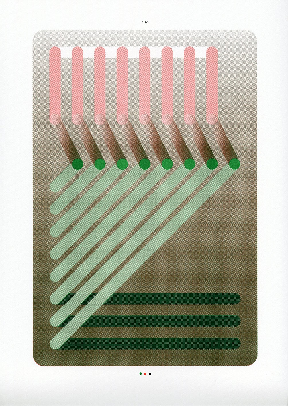
Sigrid Calon, "To the extend of / \ | & - NR.102" 34 x 46 cm (2013)
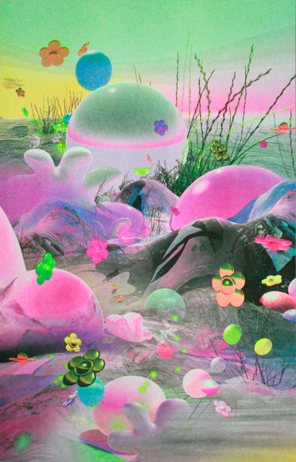
Diana Lynn VanderMeulen, "Cosmic Garden #2" 4-color Risograph 10.75x16" (2019)
|
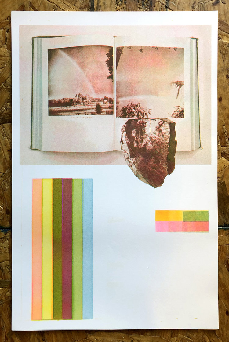
Jason Urban and Leslie Mutchler (JULMstudios), 3-color Risograph (2019)
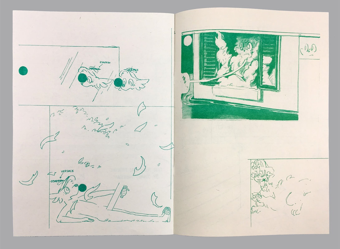
Paul Peng, "Interview with Paul Peng," Risograph on colored paper, 11.5 x 8.25" (2018)
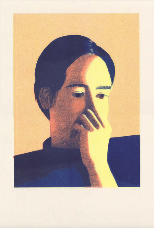
Molly Bounds, "Saturday Night (Shelby)" 3-Color Risograph
|